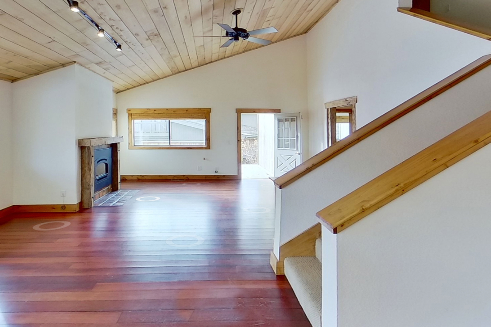
After growing up in Hailey, ID, our clients wanted a comfortable space that would draw their kids and families into reestablishing their roots. Carrying out their vision presented an incredible opportunity to transform a dated, cookie-cutter Sun Valley ski condo into a home that feels unique, yet rooted to a place and its traditions.
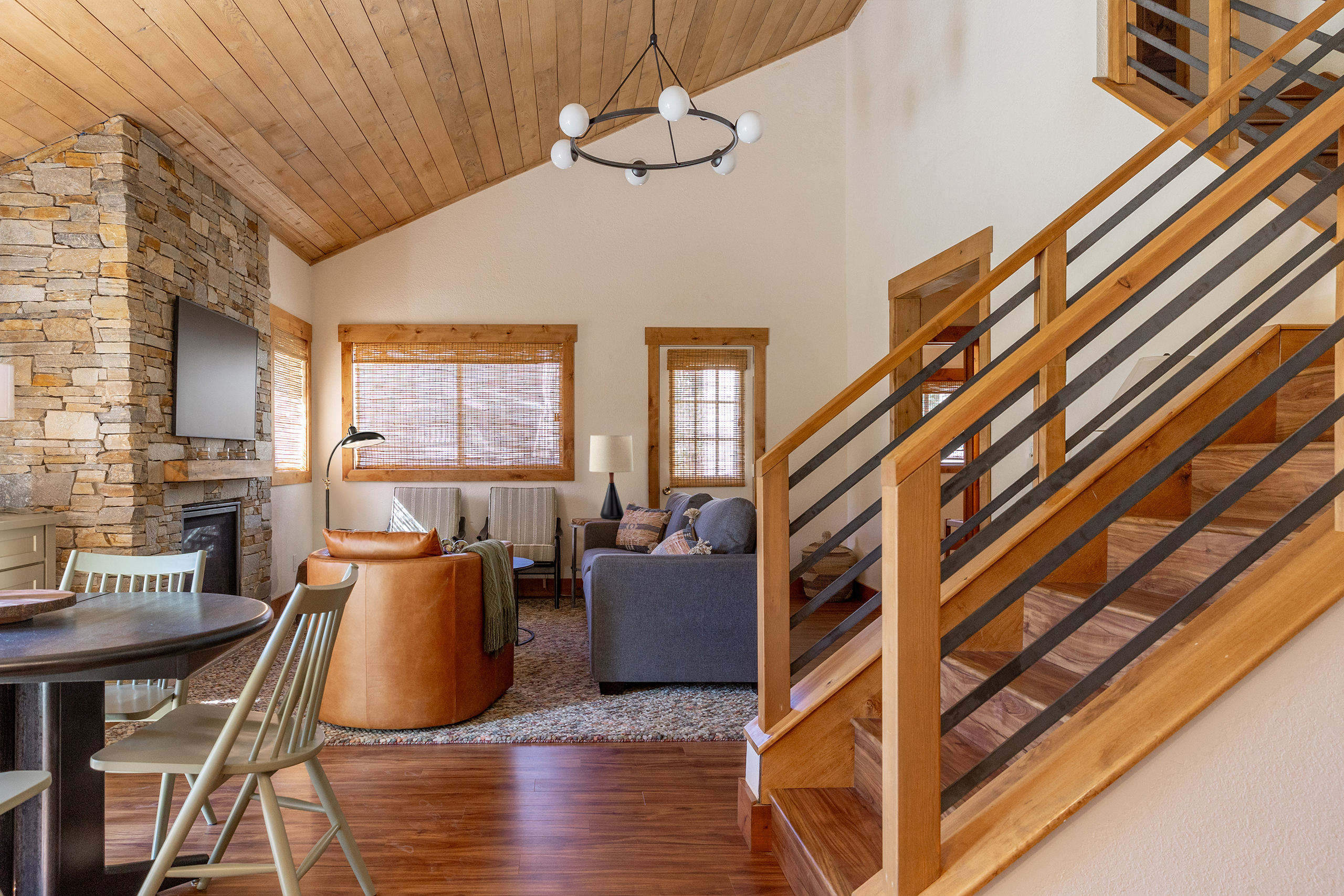
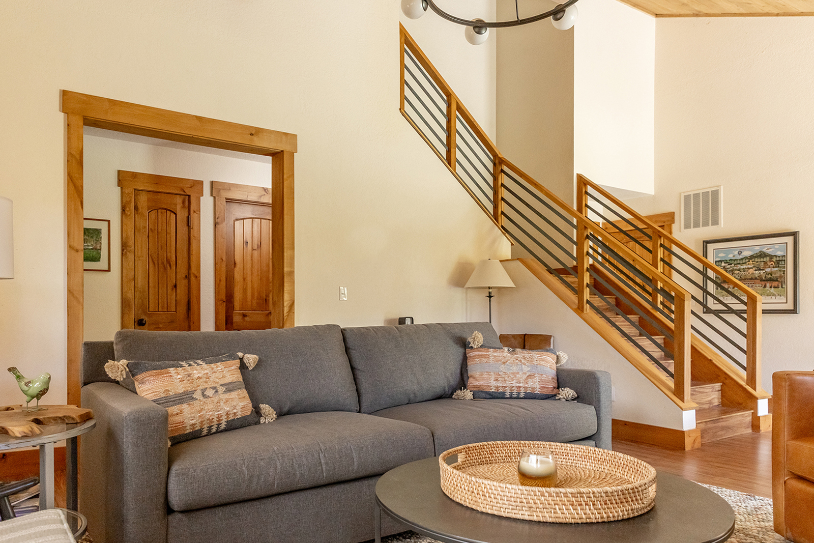
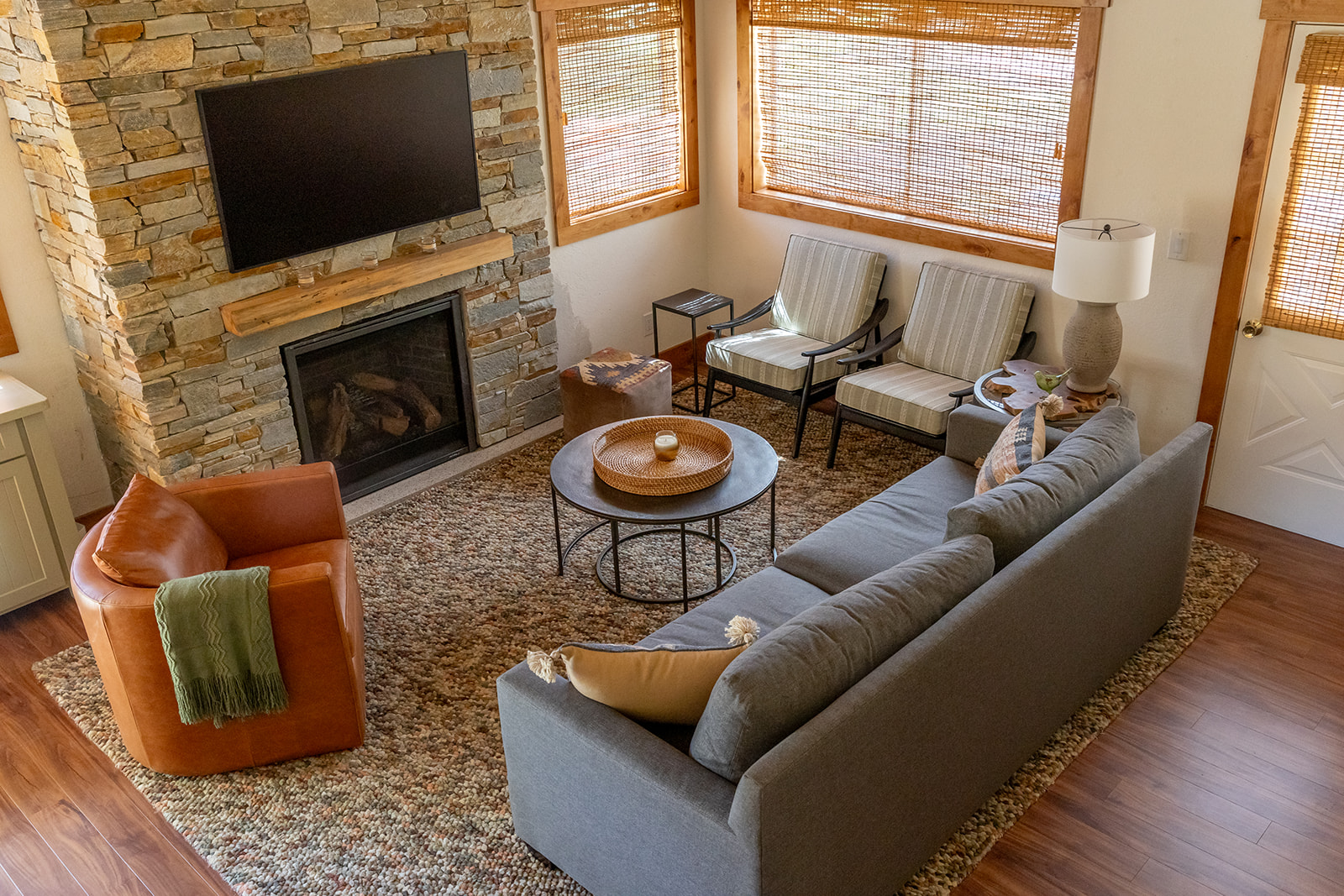
To streamline previous renovations, we focused on unifying wood tones throughout (restoring the whitewashed ceiling back to natural cedar and replacing the barnwood to match the alder trim). Updating the bulky 80s drywall railing with a custombuilt design and reframing the fireplace opened sight lines for a more balanced room. We added stone to the façade both to give it more height but also to bring in elements of the alpine environment. We suggested a light alder flooring to add variation but harmonize with the existing wood, but the client chose this faux hickory plank in the hopes that something darker and more synthetic would be easier to manage during ski season.
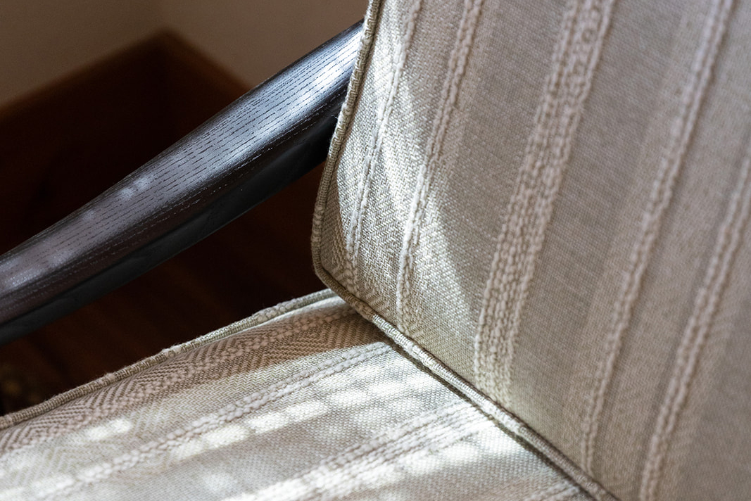
We were inspired by their love of the landscape in spring and the horse rides that lie ahead. We built an alpine equestrian design language — leather, iron, Pendleton and saddle blanket textiles — and put it in contrast with modern elements and subtle color to relate to the architecture and keep things from feeling campy.
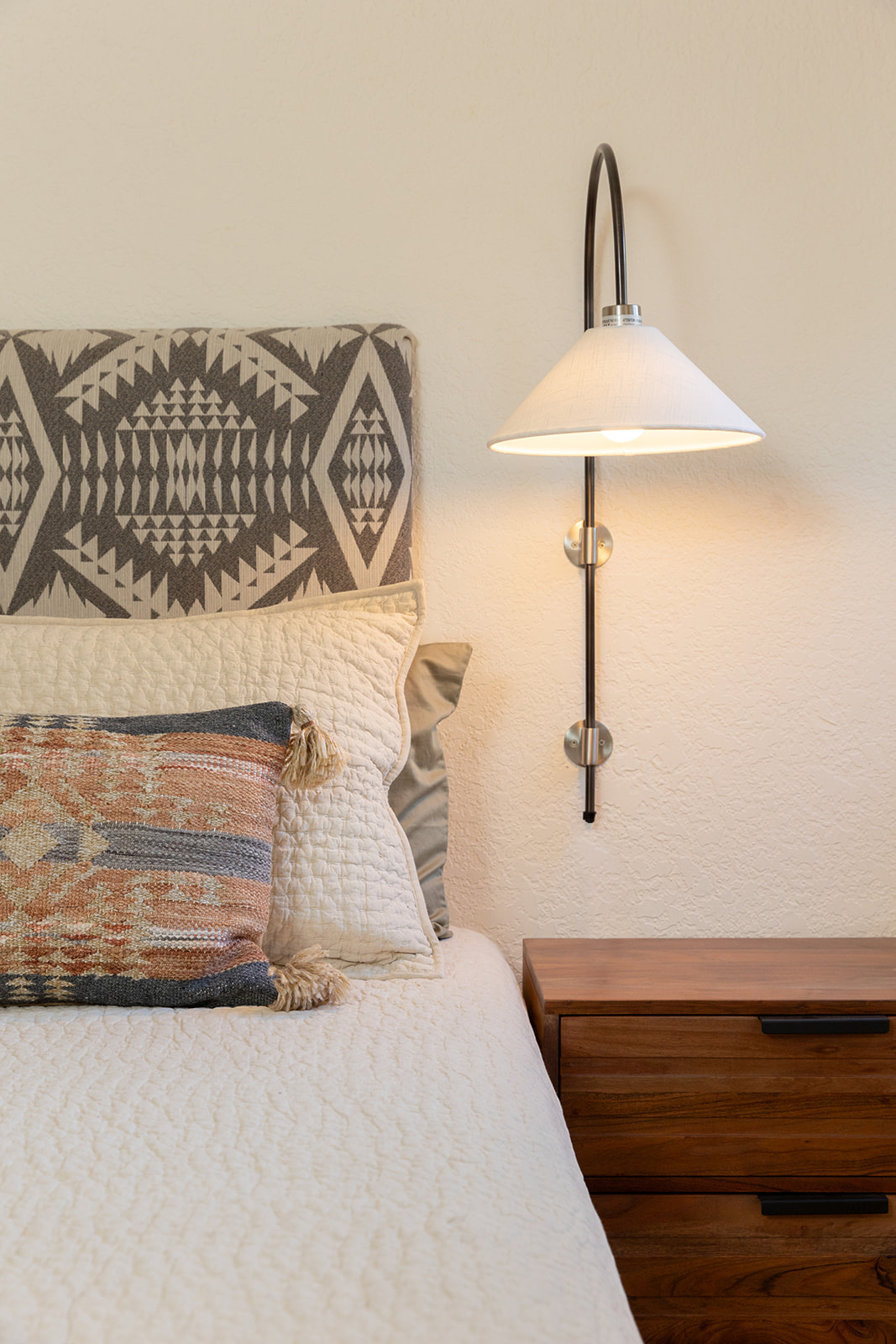
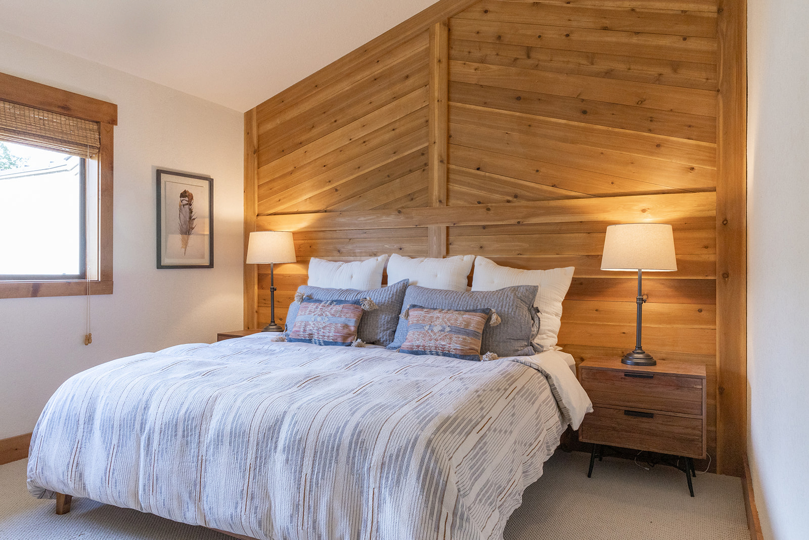
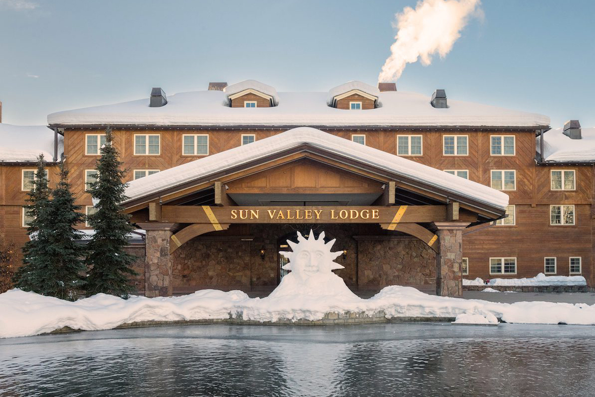
In the primary we removed a wall of bifold closets for the best mountain view and installed more cedar tongue and groove so this room felt connected. The vault ceiling inspired us to echo the design of the Sun Valley Lodge facade.
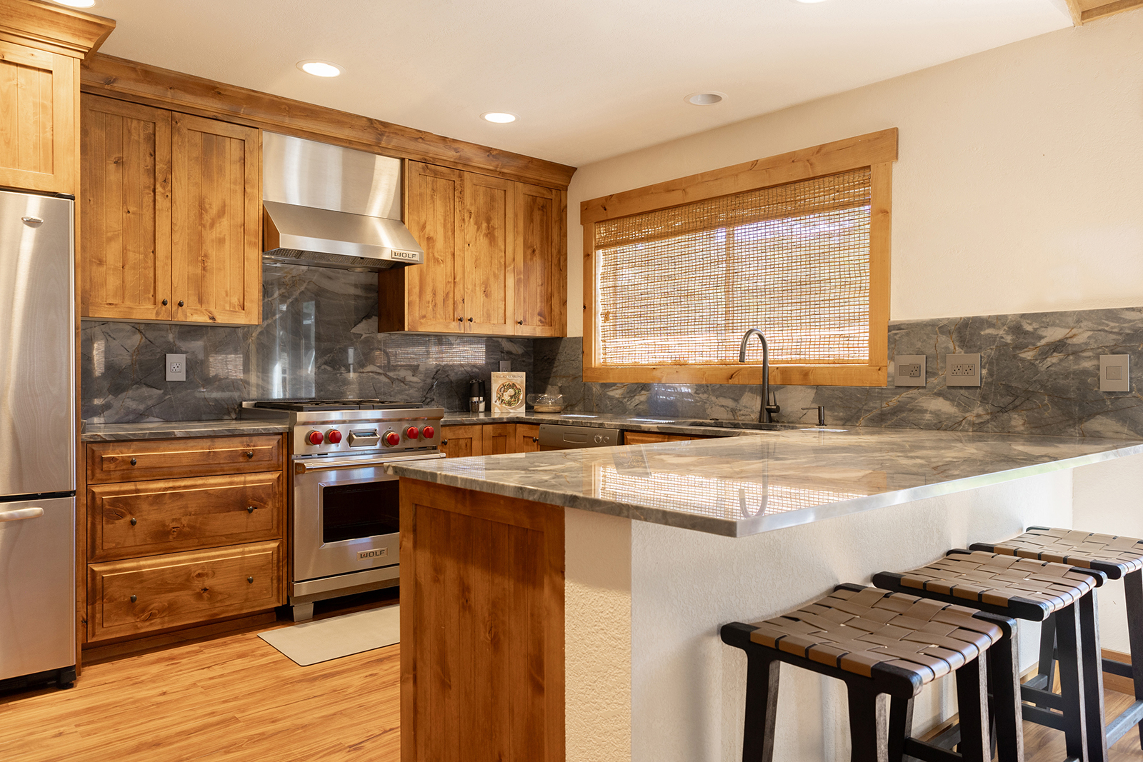
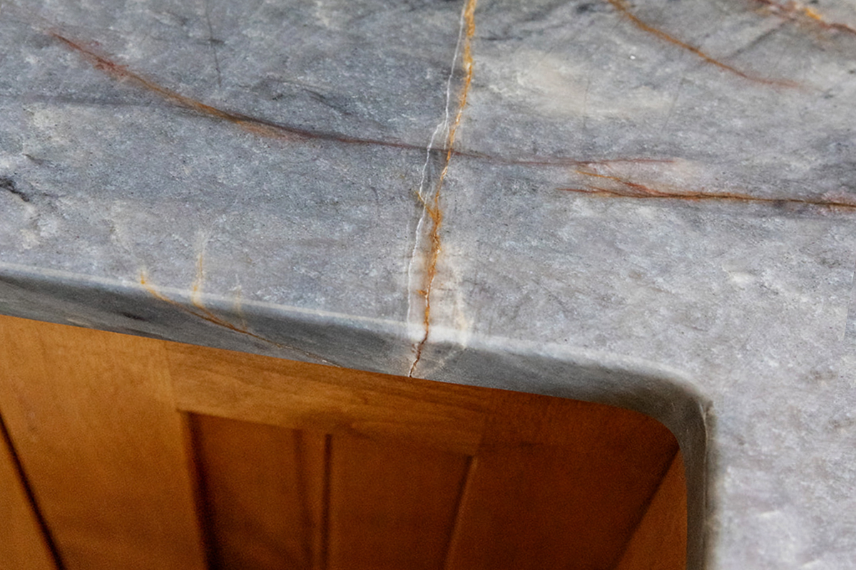
The cabinets were in good condition, and with the owner’s love of horses in mind, they reminded us of stalls in a high end stable. We replaced the tile counter tops with a breathtaking quartzite that feels like the surrounding Sawtooth mountains. The stools are the same woven leather design as the original 1936 guest rooms in Sun Valley Lodge — good design never goes out of style!
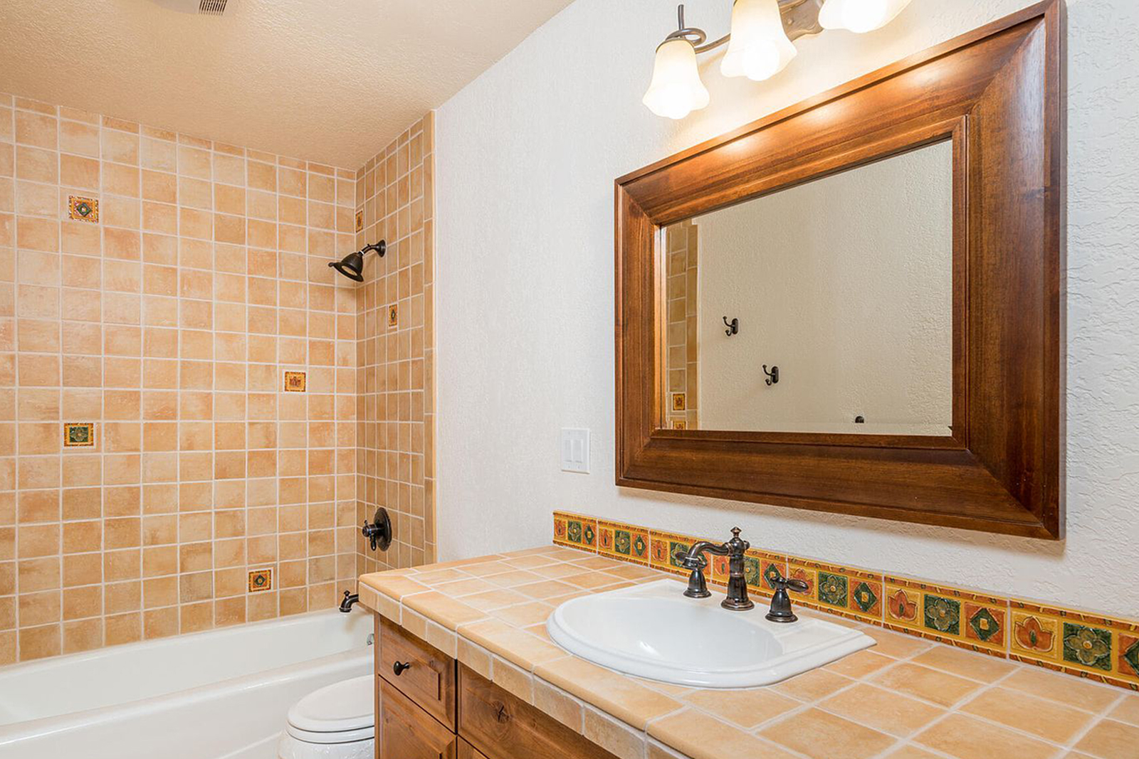
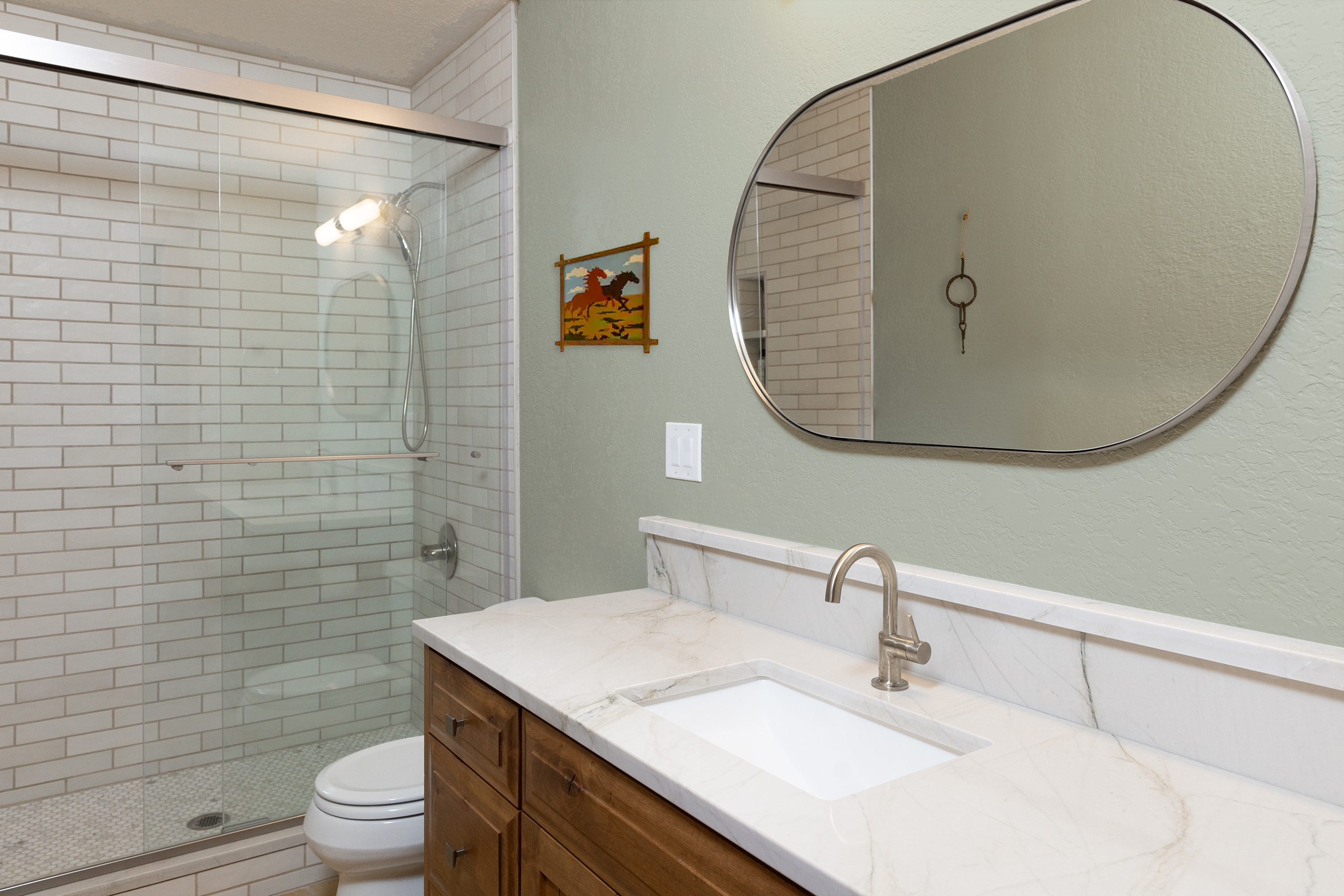
The bathrooms were both tiled top to bottom in a south-west red tile, which would have been cost-prohibitive to remove from the floor so we brought in neutral tiles on the wall and shower floor where we removed the tub. We chose a lighter quartzite to bring in a natural, stone element that connects with both the kitchen and hearth.
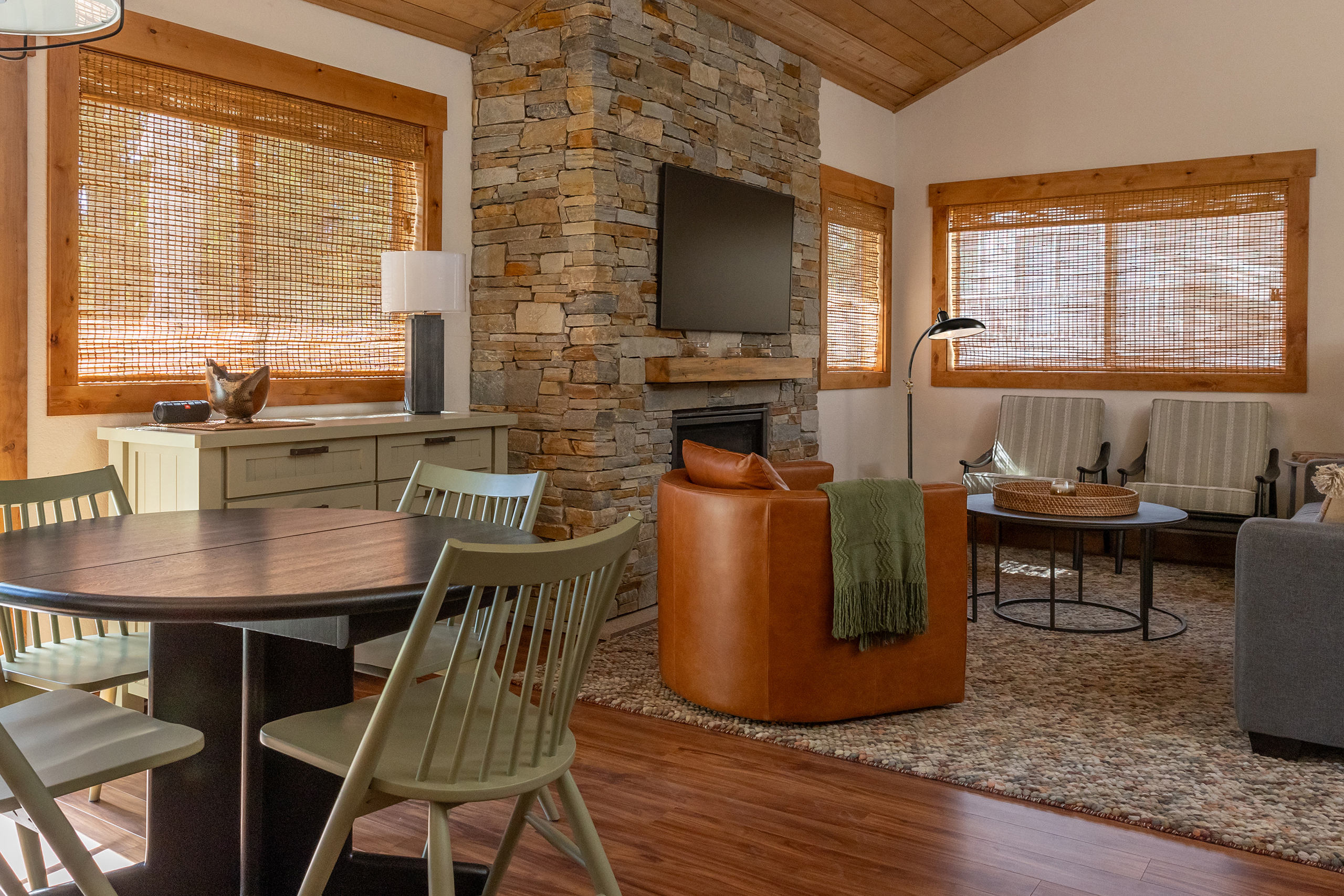
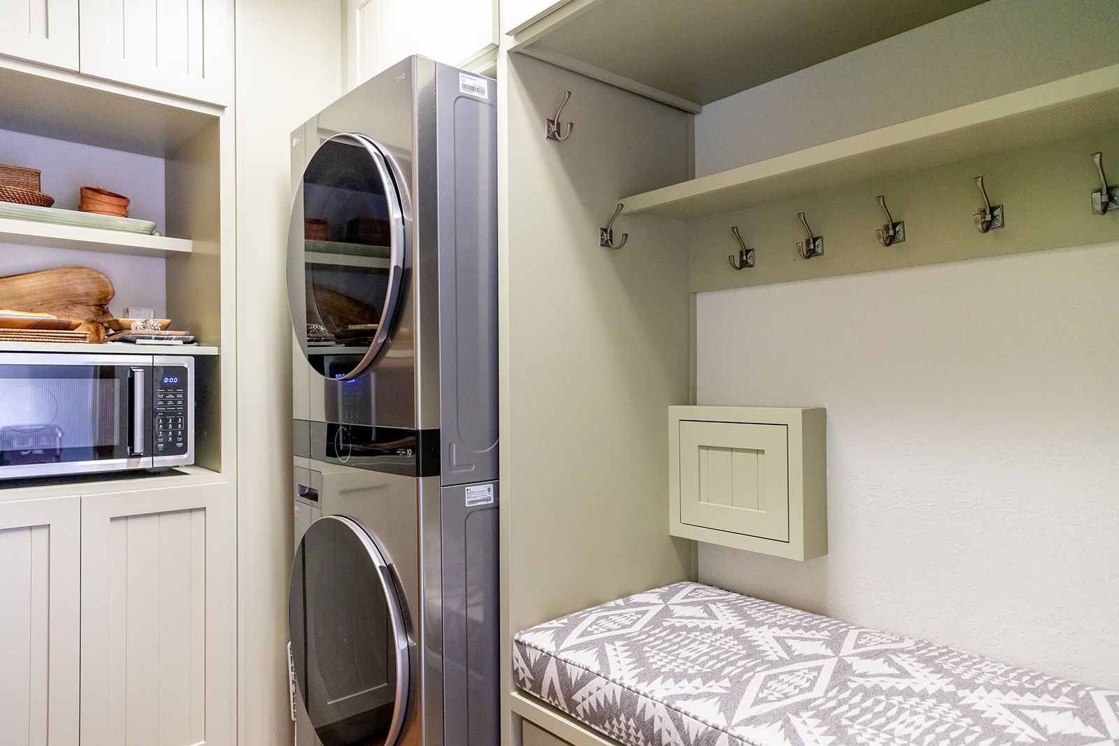
The mid-century table and living room accent chairs were stained black to bring in modern vibes to contrast with the wood. For the same reason, and consistency, we matched the dining chair paint to the custom bar and mudroom cabinetry.
FSP :
STYLE DEVELOPMENT
SPACE DESIGN
GC COMMUNICATIONS
MATERIAL SELECTION*
PARTIAL FURNISHINGS
PARTNERS :
General Contractor / Cabinetry: Veritas
Photos: Amanda René
* Flooring not selected by Fore Story
PROJECT NOTES :
Designing around existing elements always presents both challenges and opportunities. We edited materials down for consistency, and relied on the introduction of stone to the palette to make this small space feel open and comfortable in any season.
FORE STORY FINDS
A quarterly email with updates and great finds to refresh your space:

