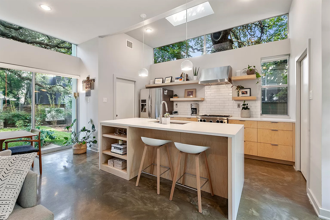
As the homeowners worked through a more functional kitchen layout with their builder, they kept feeling like it was missing the mark. The renovation was done with resale in mind, but they didn’t feel excited about it and wanted to be. Once we established what they loved, it was just materials, hardware and a few tweaks to the layout that created the connection that made it feel like home.
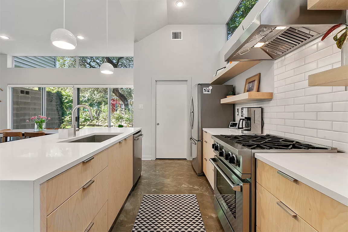
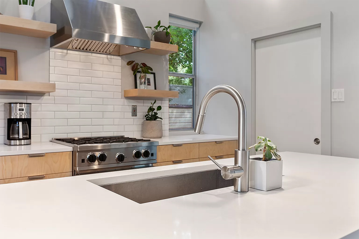
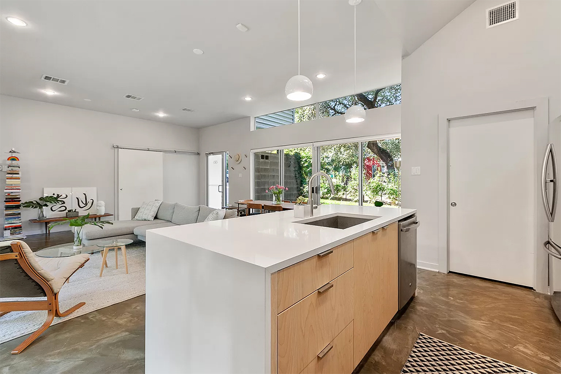
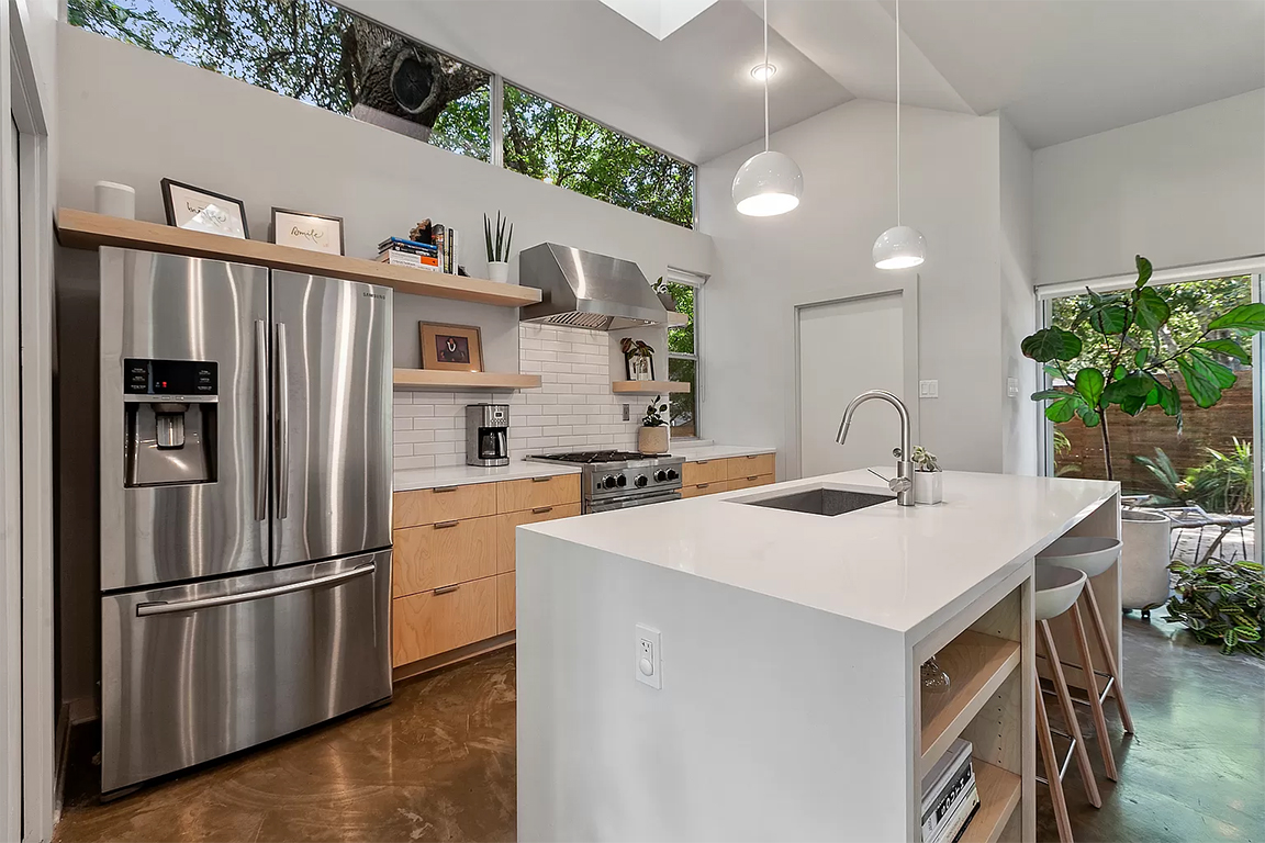
Introducing light wood surfaces for the cabinets brought a much needed organic element, while the smooth white surfaces integrated with the surrounding space. We used stainless hardware like the windows to keep the palette ultra minimal, and used opaque shades over the island give them the option for a moodier setting in a room of can lights.
We picked materials and fixtures that felt reminded the homeowners of their beloved southern California lifestyle. Birch wood and open shelving keep things casual and allow for an eclectic peppering of objects and plants to liven the space.
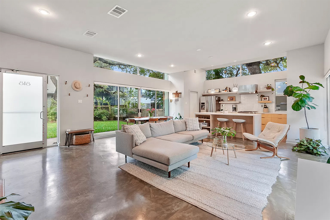
FSP :
MATERIAL SELECTION
FIXTURE SELECTION
SOURCES :
Hardware: Schoolhouse
Lighting: Schoolhouse
PROJECT NOTES :
After reviewing designs with the GC and feeling like it wasn’t hitting the mark, the homeowners asked for help personalizing the plan. As presented, the kitchen would have been cold and perpetuated the disconnection they already felt to the ultra-modern architecture. Bringing in a designer allowed them to hone in on what they loved, and why.
FORE STORY FINDS
A quarterly email with updates and great finds to refresh your space:

